SciPy Babble
By Eeshaan K B
Created June 16th, 2021
The scientific Python stack, which includes the SciPy library, NumPy, IPython, Matplotlib, SymPy and pandas is the go-to for any scientific computation, data analysis or the third element of this list that one may want to perform using Python. From scipy.org: "SciPy (pronounced “Sigh Pie”) is a Python-based ecosystem of open-source software for mathematics, science, and engineering.".
For the first article, I decided to re-learn how to use Matplotlib, or at least the resources it provides that I'll be using most often. Matplotlib and the entire SciPy ecosystem have great documentation, so learning how to use them is painless and simple. (I can't guarantee painlessness, but it is simple.)
With the first program, I aimed to do three things:
- Figure out how to plot a graph
- Figure out how to annotate that graph
- Figure out how to change styles on that graph
To do this, I used matplotlib.pyplot, which provides a large number of functions that allow us to create all sorts of simple plots.
The most basic function one could consider is matplotlib.pyplot.plot(x_values,y_values), which will plot a smooth line through each x and y coordinate provided (with the first ordered pair consisting of x_values[0] and y_values[0] and so on.).
I also used some other basic functions in this first program to add a key and label the graph.
import matplotlib.pyplot as plt

t_high = [23,23,22,25,25,20]
t_low = [18,17,11,12,17,17]
days = ['Monday', 'Tuesday', 'Wednesday', 'Thursday', 'Friday','Saturday']

plt.plot(days, t_high, label = "High")
plt.plot(days, t_low, label = "Low")
plt.plot(days, t_high, 'ro')
plt.plot(days, t_low, 'go')
plt.xlabel('Temperatures in Montreal this week')
plt.legend(title='Key')

plt.show()
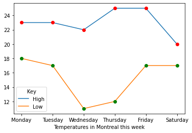
Our first plot
The second program was written just to try out some Numpy functions (np.sin and np.cos). The first time I wrote the program, I blitzed out a list of about 10 x values, not really thinking much about how many I would actually need to get a plot that had anything remotely resembling the sine and cosine functions, and was promptly reminded what an idiot I am when I hit run.
Well, on my second pass, I used np.linspace(a, b), which generates a list of 50 (or more or less, 50's the default) evenly spaced values in the interval [a,b]. This worked.
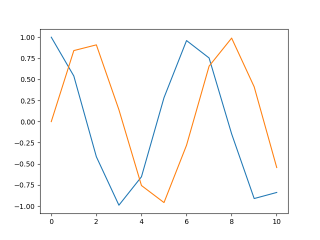
This doesn't work.
import matplotlib.pyplot as plt
import numpy as np

x_vals = np.linspace(0,6)
y_sinvals = []
y_cosvals = []

for i in x_vals:
    y_sinvals.append(np.sin(i))
    y_cosvals.append(np.cos(i))

plt.plot(x_vals, y_sinvals, 'r-', label = 'y=sin(x)')
plt.plot(x_vals, y_cosvals, 'b--', label = 'y=cos(x)')
plt.annotate('sin(π/2)', xy = (np.pi/2, 1))
plt.annotate('sin(3π/2)', xy = (3*np.pi/2, -1))
plt.legend()

plt.show()
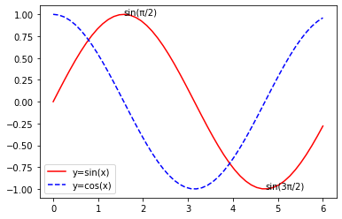
And this works
The third program was smooth sailing again, and was written to figure out how to create subplots. One thing a user might want to note is that the coordinates are assigned with (0,0) being the top-left corner.
import matplotlib.pyplot as plt
import numpy as np

fig, ax = plt.subplots(2,2)

x_vals = np.linspace(0,1)

def f(x,a_0, a_1, a_2, a_3, a_4):
    return a_0*np.exp(a_1*x)+a_2*np.exp(a_3*(-x))+a_4

y1_vals = [f(i, 1, -2, 3, 4, 5) for i in x_vals]
y2_vals = [f(i, 2, 2, 3, -4, 5) for i in x_vals]
y3_vals = [f(i, -1, -3, 3, 4, 5) for i in x_vals]
y4_vals = [f(i, 1, -2, -4, 4, -5) for i in x_vals]

ax[0, 0].plot(x_vals, y1_vals, 'r-')
ax[1, 0].plot(x_vals, y2_vals, 'b-')
ax[0, 1].plot(x_vals, y3_vals, 'g--')
ax[1, 1].plot(x_vals, y4_vals, 'y--')


plt.show()
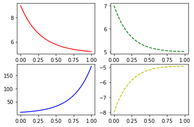
COVID case progressions in different universes.
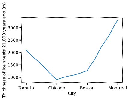
The fourth program had no real utilitarian purpose and was just to try out the xkcd style plotting feature for fun.
import matplotlib.pyplot as plt
import numpy as np

with plt.xkcd():
    plt.plot(['Toronto', 'Chicago', 'Boston', 'Montreal'], [2100, 900, 1250, 3300])
    plt.xlabel('City')
    plt.ylabel('Thickness of ice sheets 21,000 years ago (m)')

    plt.show()
Well, that's about it. Relevant links will probably be below this paragraph and the next article's probably going to be about applying Matplotlib and learning how to use pandas, the SciPy stack's data analysis library.
SciPy's official website (Has links to the entire ecosystem's individual websites)
